This week, the Wanderings crew is tackling comics covers. Of course this is very subjective, but we are going to give it a go. Shawn Hilton from Comics Cubed is back again this week to join in the fun. Without further ado, here are some amazing covers.
Disclaimer from Mr. Hilton: What kind of lunacy is a TOP 3 COMIC COVER LIST? Of THE WEEK? No, of ALL TIME? Might as well ask a parent which kid is their favorite. If it were a TOP 3 covers of a specific artist I MIGHT be able to decide. Do I go Kirby, Steranko, Perez, Byrne, Sienkiewicz, Alex Ross? Do I look at ICONIC COVER like Action Comics #1, Amazing Fantasy #15, FF #48? Perhaps it’s the top 3 GIMMICK COVERS and then I’m looking at glow in the dark, metallic covers, holograms, origami (looking at you FORCEWORKS #1), Gems glued to the cover (Eclipso), bullet holes (I don’t remember but it was done).
It’s just not something my brain can wrap itself around so I’ll just let my brain go on a wonder and let it come up with 1 MARVEL cover 1 DC cover and 1 Indie cover.
Marvel Cover:

Ray: Amazing Spider-Man #121 by John Romita Sr.
This is probably the best example of how to do clickbait right I’ve ever seen. It’s a concept for a cover that shouldn’t work for many reasons –
it doesn’t reflect the content of the comic (Peter does not know one of his loved ones is going to die). It’s cluttered. It’s chaotic. But it’s one of the most brilliant and striking examples of how to catch a viewer’s eye I’ve ever seen. It’s not like any other ASM cover, which immediately sets the tone that something very different and very bad is going to happen this issue – and the content doesn’t disappoint on that front. I have no doubt that those who saw this cover on their store shelves for the first time in the 1970s were not able to walk away without reading it, and that’s the brilliance of this one.
Steve: Jack Kirby Machine Man

What is a comics cover list without Jack Kirby? Incomplete! While some people don’t enjoy Kirby’s style, especially his face work, his contribution to comics is indisputable. Going one step further, his cover are solid gold! They are alive, bristling with energy. While many covers are pinups, Kirby’s are filled with action and movement. I especially love his use of foreshortening. The action is leaping off the page. Machine Man isn’t the most well-known Marvel property, but the covers are great examples of Kirby’s work. Simply search Kirby covers and you will see this technique used on the Fantastic Four, Eternals, Fourth World books, etc. There will never be another Kirby.
Shawn: Arthur Adams Classic X-Men #1.

Art Adams is an artist I’ve loved since seeing this cover and his work on a Longshot miniseries. His style is HIM. No one else is quite like Art Adams and it jumps from a spinner rack or a shelf right at your eyeballs. His classic X-MEN #1 is superb showing off the two generations of X-MEN icons in a pinup style cover that was perfect for posters, t-shirts, album covers, and anything else you might have wanted to slap it on. Take that art and a unique reprint book (Classic X-Men allowed Claremont to retcon his own work in the book and add all new back up material).
It’s a wonderful cover that holds up to this very day.
While looking into the specifics of this cover I found this superb write up that goes into amazing detail about the creation.
DC Cover:
Ray: Action Comics #583 by Curt Swan

By contrast, this is a comic cover that makes you feel strong emotions. I know the other “last Superman cover” – Superman #75 – is more iconic, and its starkness made a good case for its entry on this list. But this conclusion to “Whatever Happened to the Man of Tomorrow” is so perfectly simple, so melancholy, and so final that it stuck in my mind much longer. It fits with the poignant, ambiguous nature of Alan Moore and Curt Swan’s farewell to pre-Crisis Superman. Special points to the way it pays tribute to Superman’s large, varied supporting cast while keeping the man himself front and center.
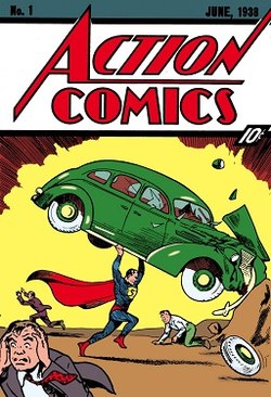
Steve: Action Comics 1

I tried not to pick this one, but I just couldn’t deny it. It’s the first appearance of Superman and quite frankly, it’s a well designed comic. Although it is very old, it has a more modern sensibility. It is not overly busy as some older comics were. There are no word balloons that populated the pages of books from yesteryear. Instead, Joe Shuster lets Superman take center stage. He creates movment by posing Superman at an angle as he lifts the car. In the bottom corner foreground, diagonally down and left from Superman, a man is panicking at the action going on behind him. Again, the angle creates movement for the static image.
Shawn: JUSTICE LEAGUE #1 by Kevin Maguire and Terry Austin

This cover is another great pin up style poster cover that could have been used as a movie poster. It features all the B level characters plus one A level character that make up the team (you decide who the one A level character is) and one word balloon from Guy Gardner. The colors of the costumes pop, the line work is dead on, Terry Austin is a legend for his inks, and even the title layouts, DC bullet, and issue number, price box, and comics code symbol are all laid out perfectly. The only thing that mars this cover is the UPS code box.
This cover has gone on to be used and used again. Parodied, swiped, borrowed, by nearly every comic company on the planet. It was a book that really cemented in my mind what the late 1980’s DC comics were all about and that cover still lives rent free in my mind all these years later.
Indie Cover:
Ray: Bandette Vol. 1 by Colleen Coover

This is just a brilliant study in minimalism. Look at the sheer kinetic energy coming off this cover. With only a few colors, relatively few lines, and only one character on the page you get a perfect feel for the type of energy this comic is going for. This not only feels like a superhero/vigilante comic, it feels like one about a character who loves what she does and is likely bringing some joy and youthful enthusiasm to a world that might have a bit of a noir bent. Coover’s art is no less charming on the inside, but this splash of color and energy on the cover might be her best piece of art.
Steve: Essex County – Jeff Lemire

Jeff Lemire is a master story teller with a very unique art style. I imagine that it is a turn off for many people, but I love it. And more importantly, he uses the simple lines with story telling techniques to get the most out of his stories. On this cover, he cleverly shows the characters from the stories within Collected Essex County set above a root system. He is showing that the characters roots, and their stories, run deep throughout the county. Really a cool cover, and the splash of red from Lester’s cape against the deep blue sky is the finishing touch.
Shawn: BORIS THE BEAR #1

Dark Horse Comics presents a little bear with a big gun. To be fair this cover isn’t that amazing for the actual artwork, inks, colors, or use of space. There are far better covers based on those things. However, this cover marks a tone in the comic world that people were getting sick of all the TEENAGE MUTANT NINJA TURTLE clones. In the year 2021 we all know and very likely love TMNT, but back in the 1980’s when they first crawled out of the sewers and onto comic pages, they were a massive hit. This lead to EVERYONE out there copying the theme and naming trope and putting out a LOT of trash.
Boris was a book similar in style, black and white, an animal (anthromorphic) with human thoughts and actions, small press, and violence. This little bear set out to KILL all those other characters and he got the job done.
While this cover isn’t the icon the other two are on my list, I think it’s an interesting time and point in the world of comics brought forward onto the cover of a comic. Plus, I love me some Boris the Bear.
For more pop culture goodness, come back to W&W Pop Culture.